" Responsive Design is an effective solution which offers a user experience in adequacy with the desired custom
Nowadays, the part of the Internet users who connect via a smartphone or a tablet is in constant increase. Web sites have to adapt themselves from then on to this evolution via the optimization of the browsers mobile.
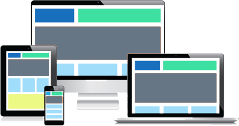
Every technology (tablet, smartphone or computer) has its own characteristics and a resolution of screen.
The objective
The responsive design has for objective to offer an optimal visual comfort for every user's profile. The reading and the navigationon the site is appropriate to every tool (smartphone, tablet or computer).
Indeed, columns and images fit, resize and move automatically as the resolution of screen demands it. This technique allows a custom-made ergonomics while protecting intact the quality of the information of the web site.
The advantages
- Easy management :the company has only a single site to be managed, with a single URL. The updates are facilitated at the same time and few.
- Navigation confort : : the site adapts itself to the size of the screen and offers a better visibility of the various elements. Furthermore, the Internet user does not have to adapt himself to a new platform. Finally, the responsive design shows first and foremost the most relevant elements to the Internet users.
- Easy to set up : : it is possible to integrate the design responsive after the initial conception of the site. Given that it is about a single URL, the work is simplified compared with a mobile application.
Width of the PC

Width of a mobile pone